Leap Card
22% of users abandon Leapcard.ie's registration at step 2, before they ever reach the product.
Leapcard.ie, Ireland's national transport payment system, has two separate registration routes that lead to different pages with different layouts. For a 3M+ cardholder product, this is a first-impression failure with direct conversion consequences.
How might we simplify Leapcard.ie's account creation so that any user, from tech-confident to elderly, can register in under 2 minutes?
What is Leapcard.ie?
Ireland's national contactless transport payment system, 3M+ cardholders, bus, Luas, and DART. No auto top-up, no notifications, and a registration flow that fails 1 in 5 users before they reach the product.
The data confirmed the problem
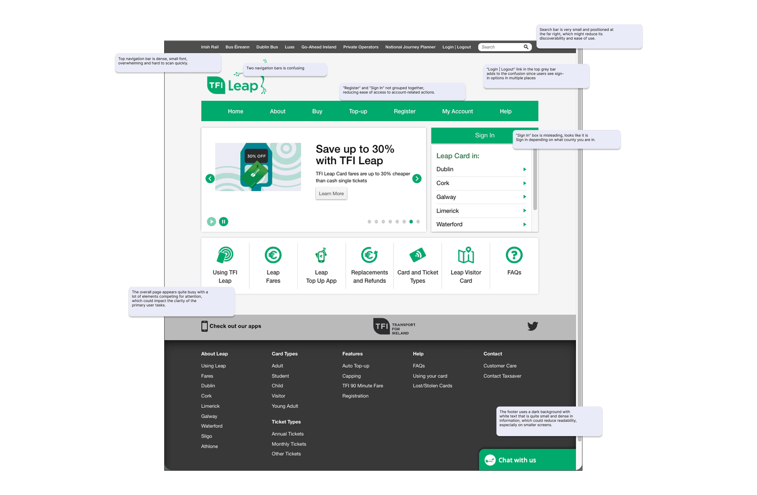
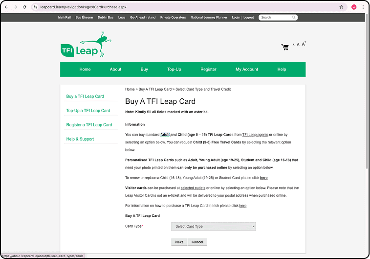
22% abandon at step 2. 4-minute average registration vs a 2-minute industry benchmark. 3.4/5 CSAT, below the government service average. SimilarWeb shows average session duration of 2:46, shorter than a completed registration.
"The site's average session is shorter than it takes to register. Users are leaving before they finish."
Five users. Three consistent findings.
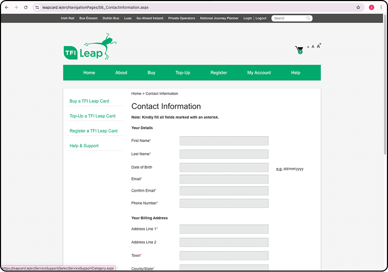
All 5 noticed duplicate registration paths and hesitated without prompting. 4/5 felt uncertain after completing a top-up. All 5 said progress indicators were completely absent, the form felt endless.
"Why do they need so many details just to create an account?"
One clear way in
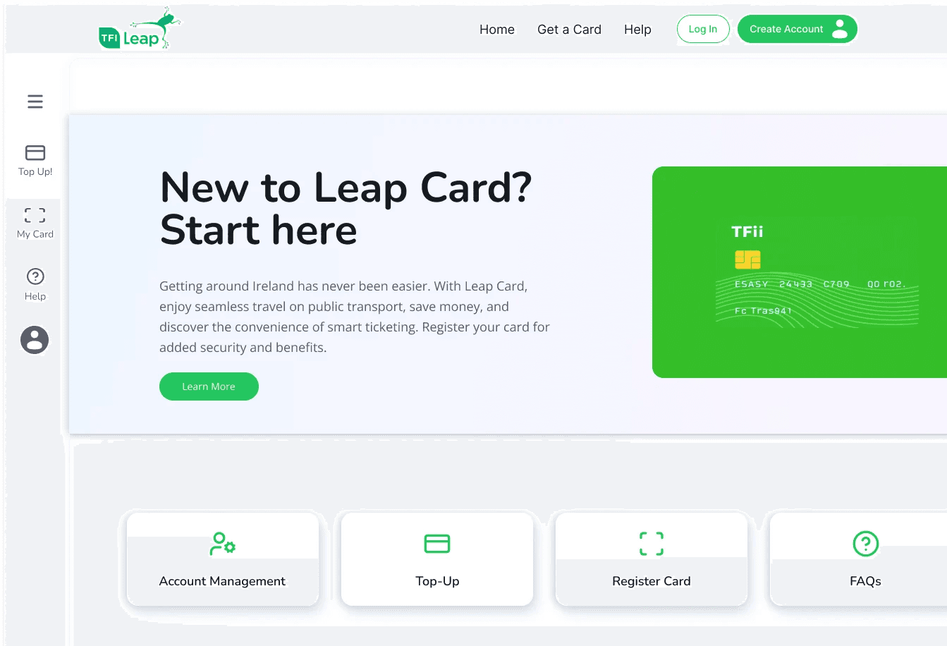
A new homepage CTA, 'New to Leap Card? Start here.', replaces the buried navigation link. Three clear actions: Register a Card, Buy a Card, Top Up. Removes the decision paralysis at the most critical onboarding moment.
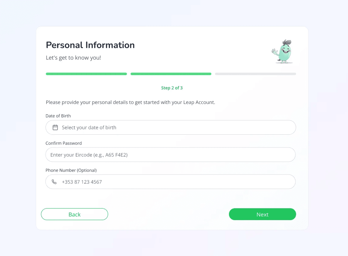
3 steps. Progress visible throughout.
The multi-tab layout replaced with a linear 3-step flow: Personal Info → Contact → Password. Maximum 4–6 fields per screen. Progress bar visible throughout. Clear success state at completion.
"Every change maps directly to a usability finding. Nothing was redesigned for aesthetics."
8 screens. Each one answering a finding.
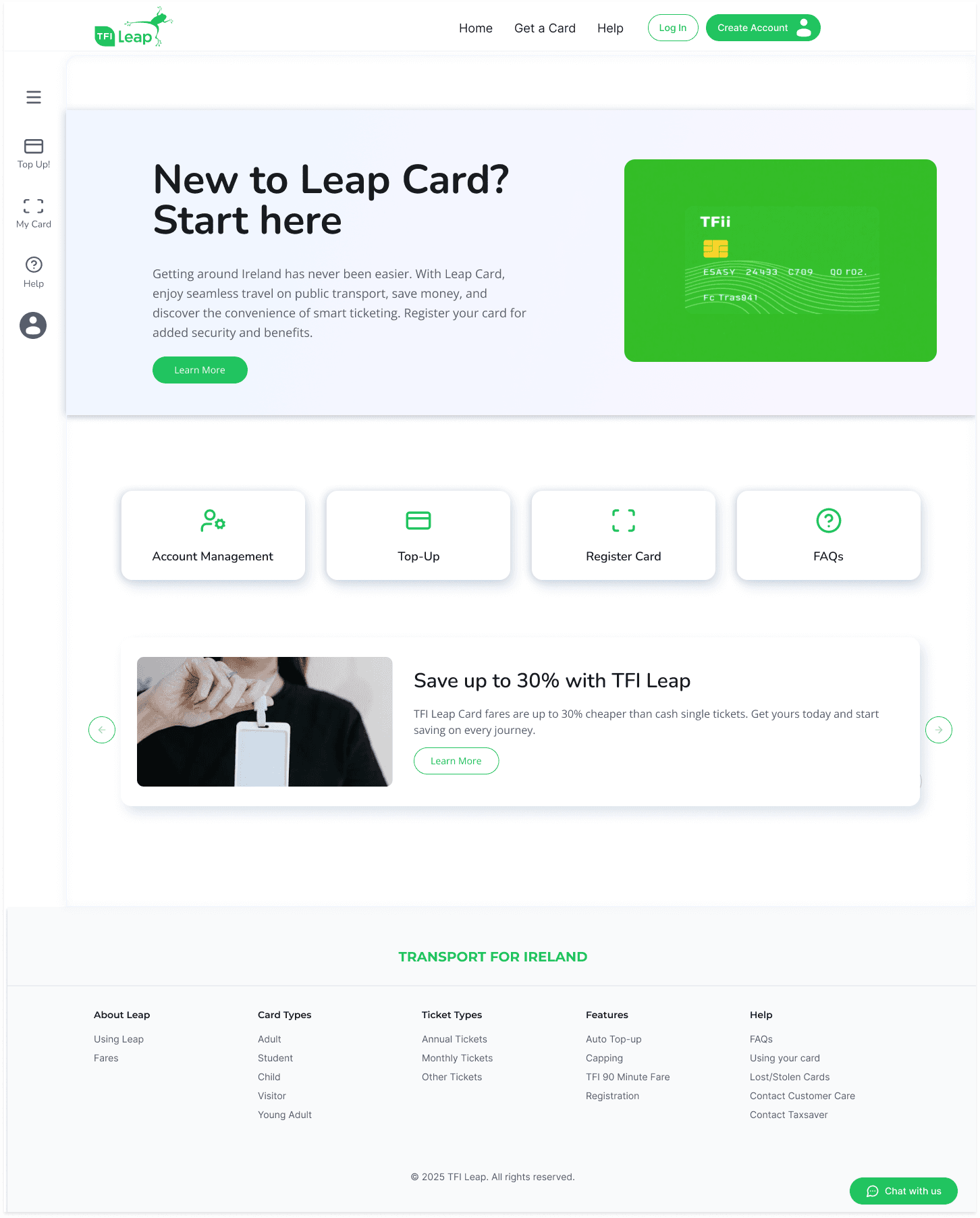
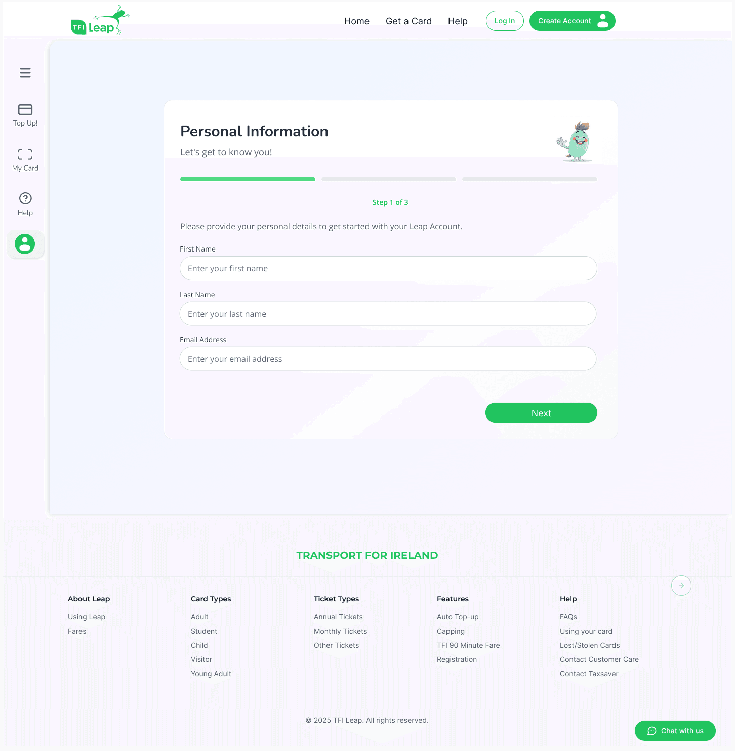
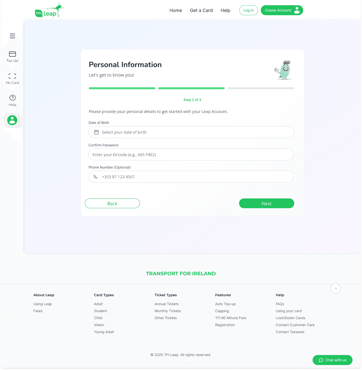
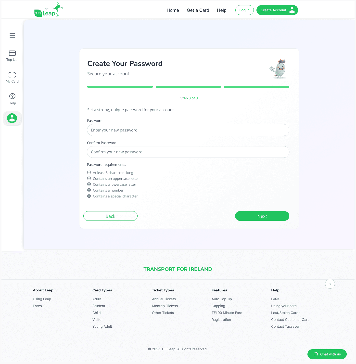
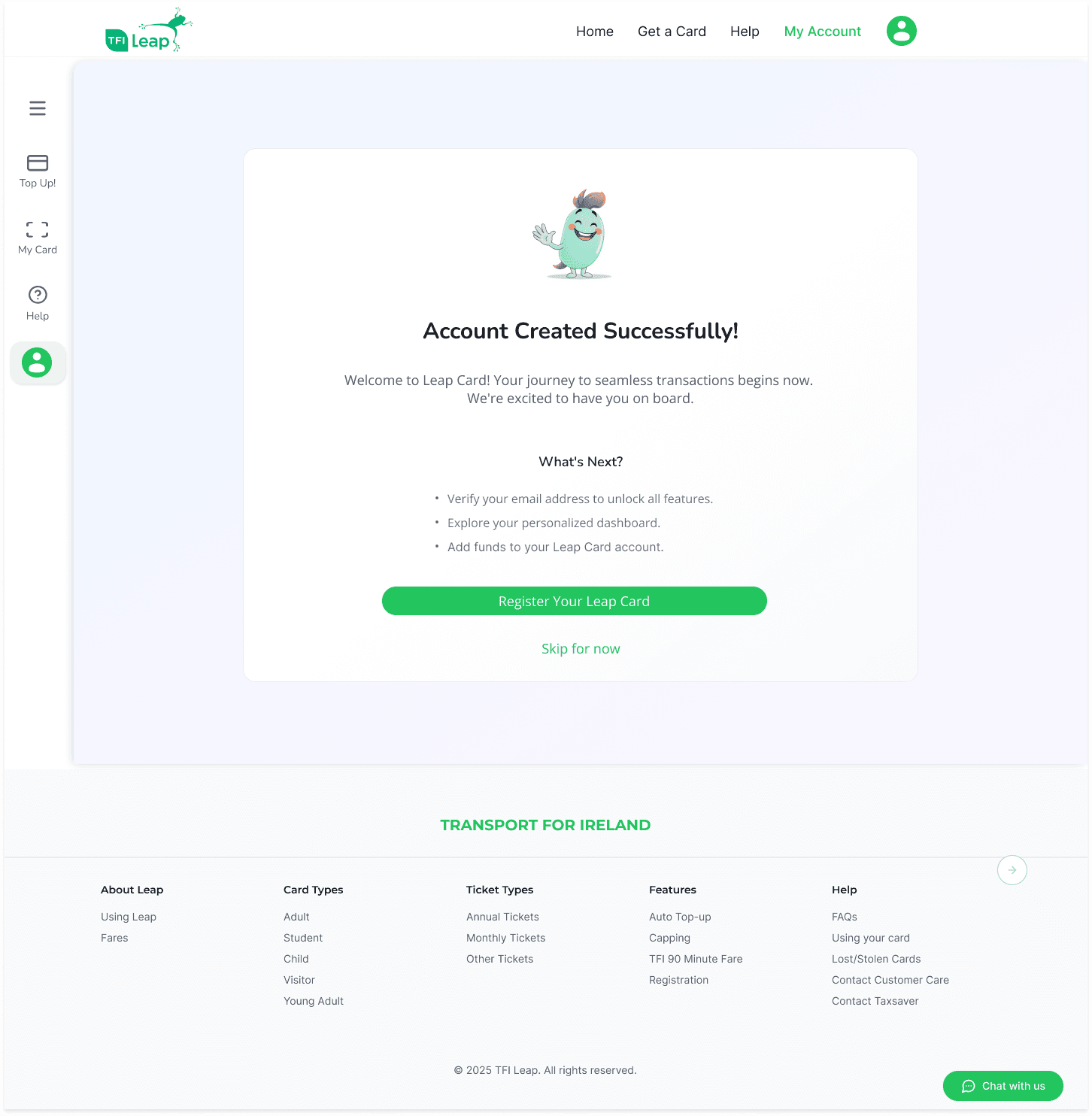
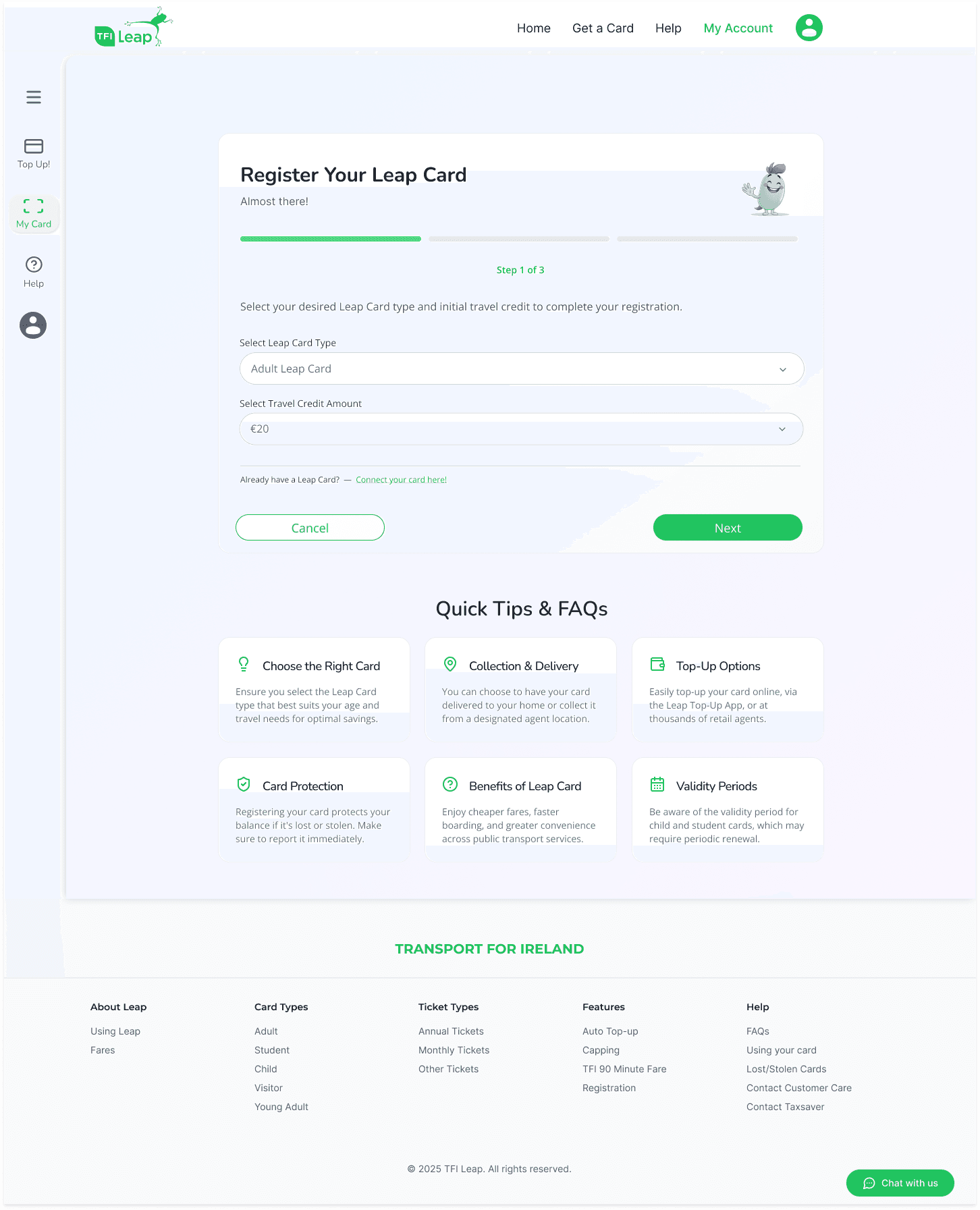
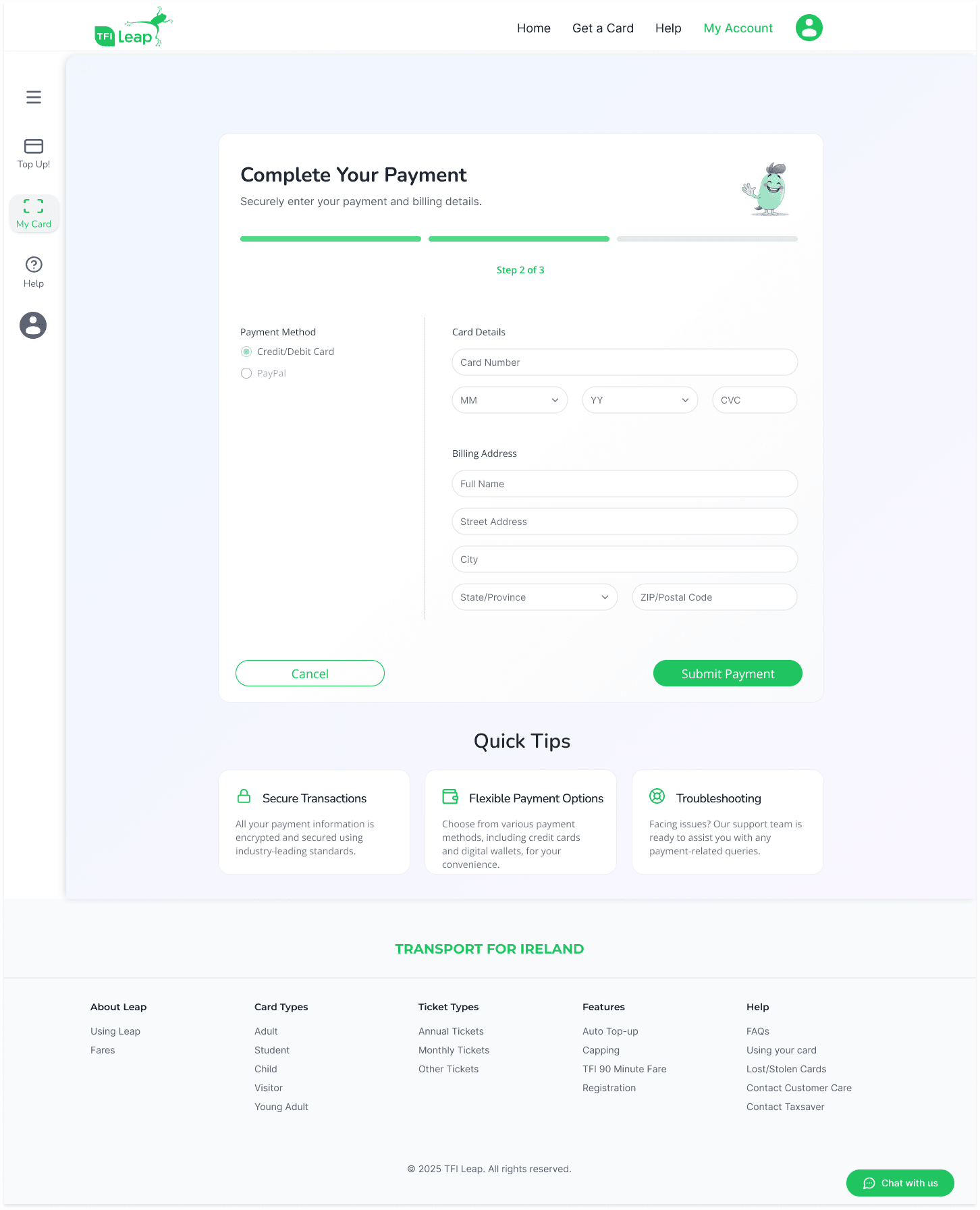
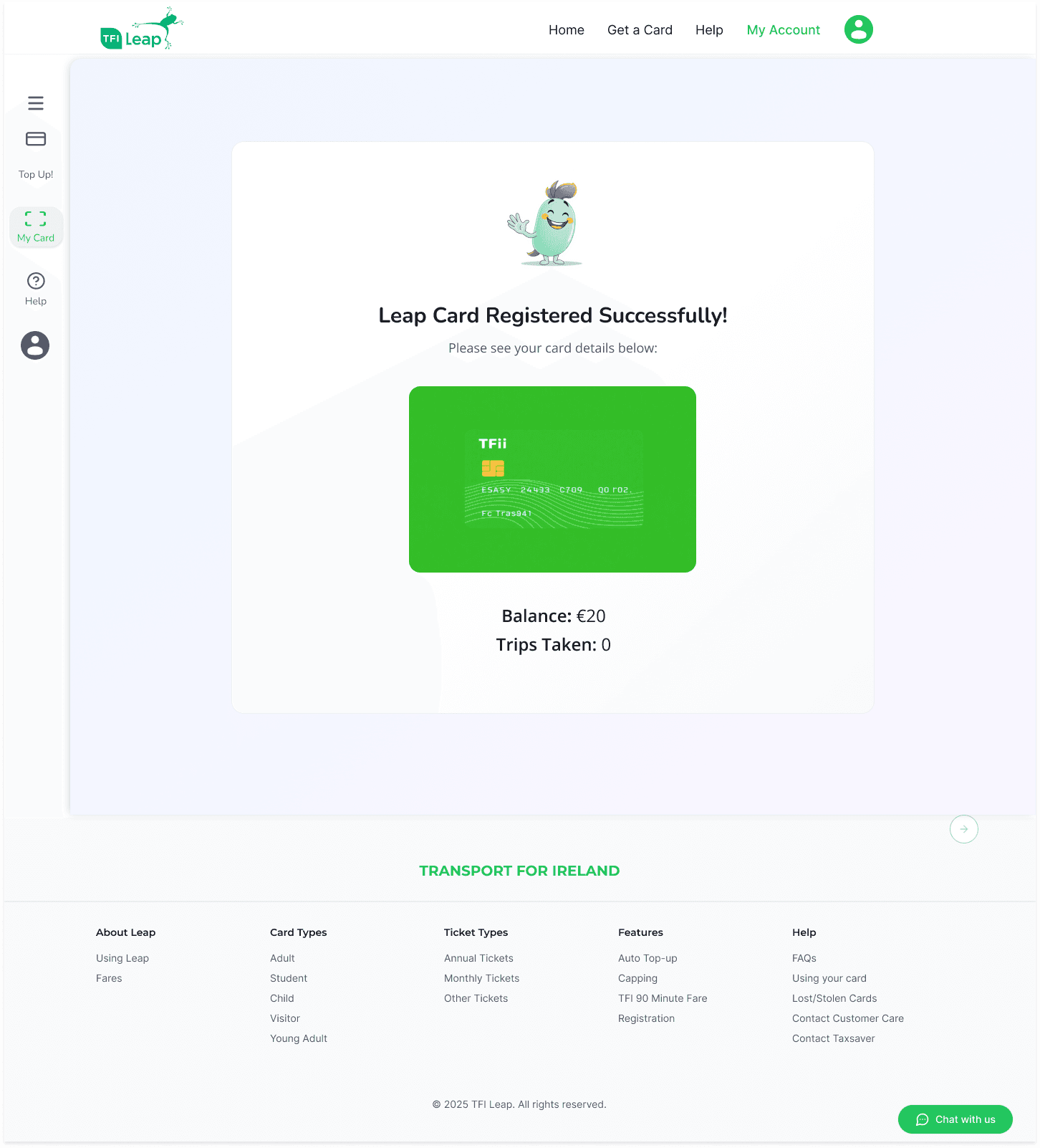
All 5 participants flagged the same root cause without prompting, the duplicate registration path. The research gave unambiguous design briefs.
Every wireframe decision traces back to a specific finding. No screen was redesigned for aesthetics alone.
A/B test the new homepage entry point with registration start rate as the primary metric and completion rate as secondary.
A second usability round with 3 elderly users specifically to validate the accessibility and readability improvements.