Nudge
Food delivery apps are functionally identical and hide their AI. Nudge makes curation visible and turns group ordering into a game.
Design a food delivery iOS app across five assignments, from concept and wireframes through to a token system, component library, and high-fidelity interactive prototype.
How might we design a food delivery app that feels personally curated, and turns group ordering from the most frustrating part of the experience into something people actually enjoy?
nudge
Curated for you. Ordered together.
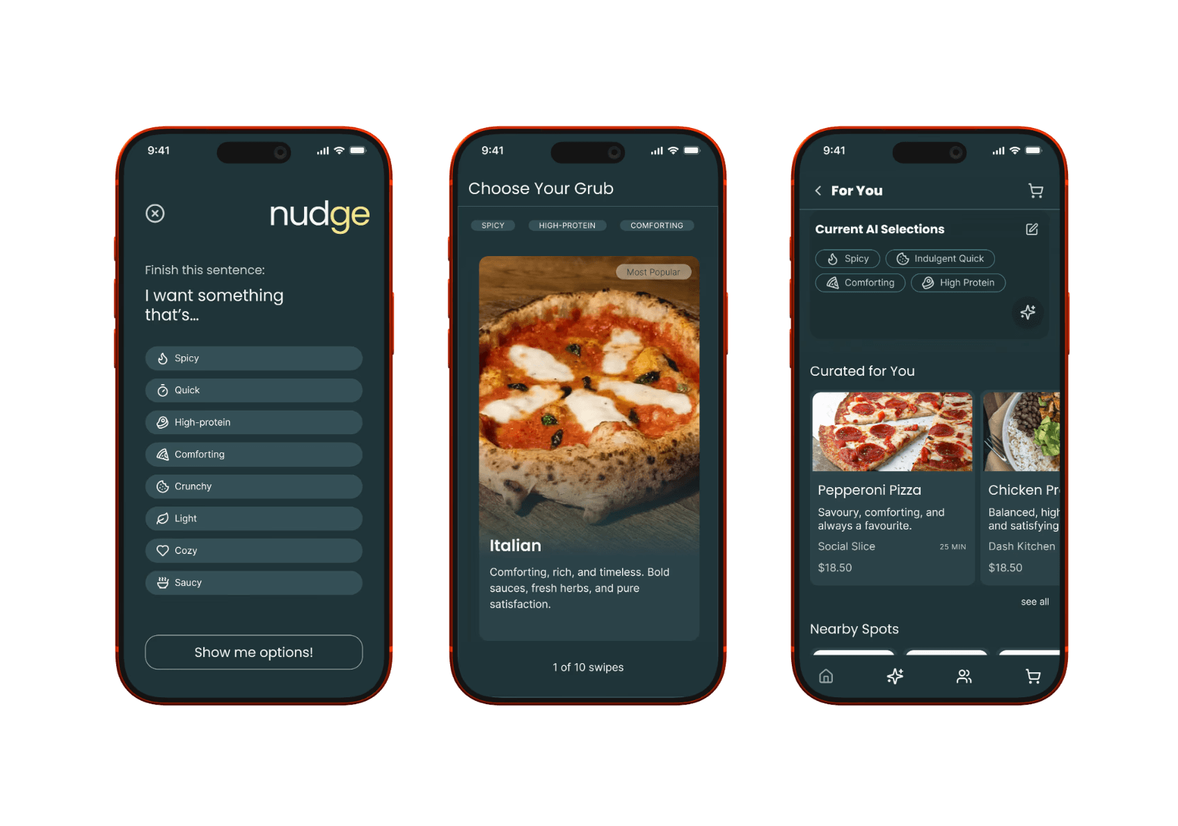
Wireframes - the foundation every subsequent assignment built on.
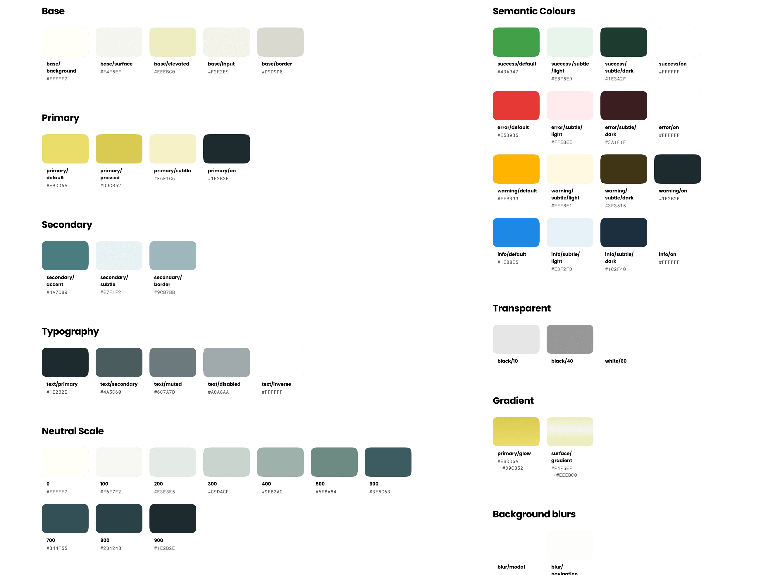
Light and dark mode in parallel — full semantic colour set.
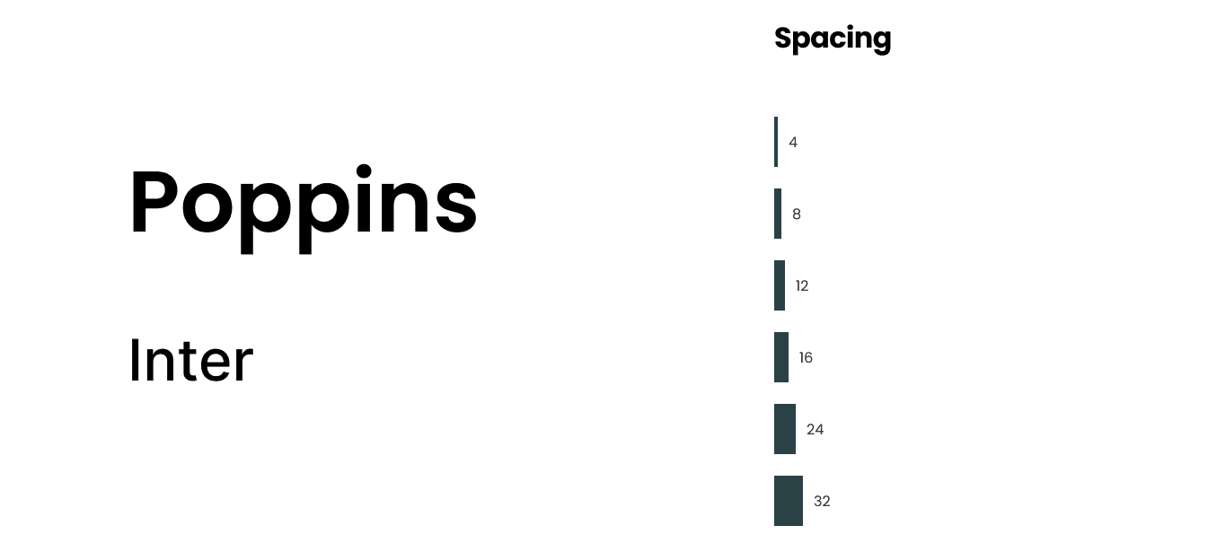
Poppins for headings, Inter for UI. Spacing scale 4–32.
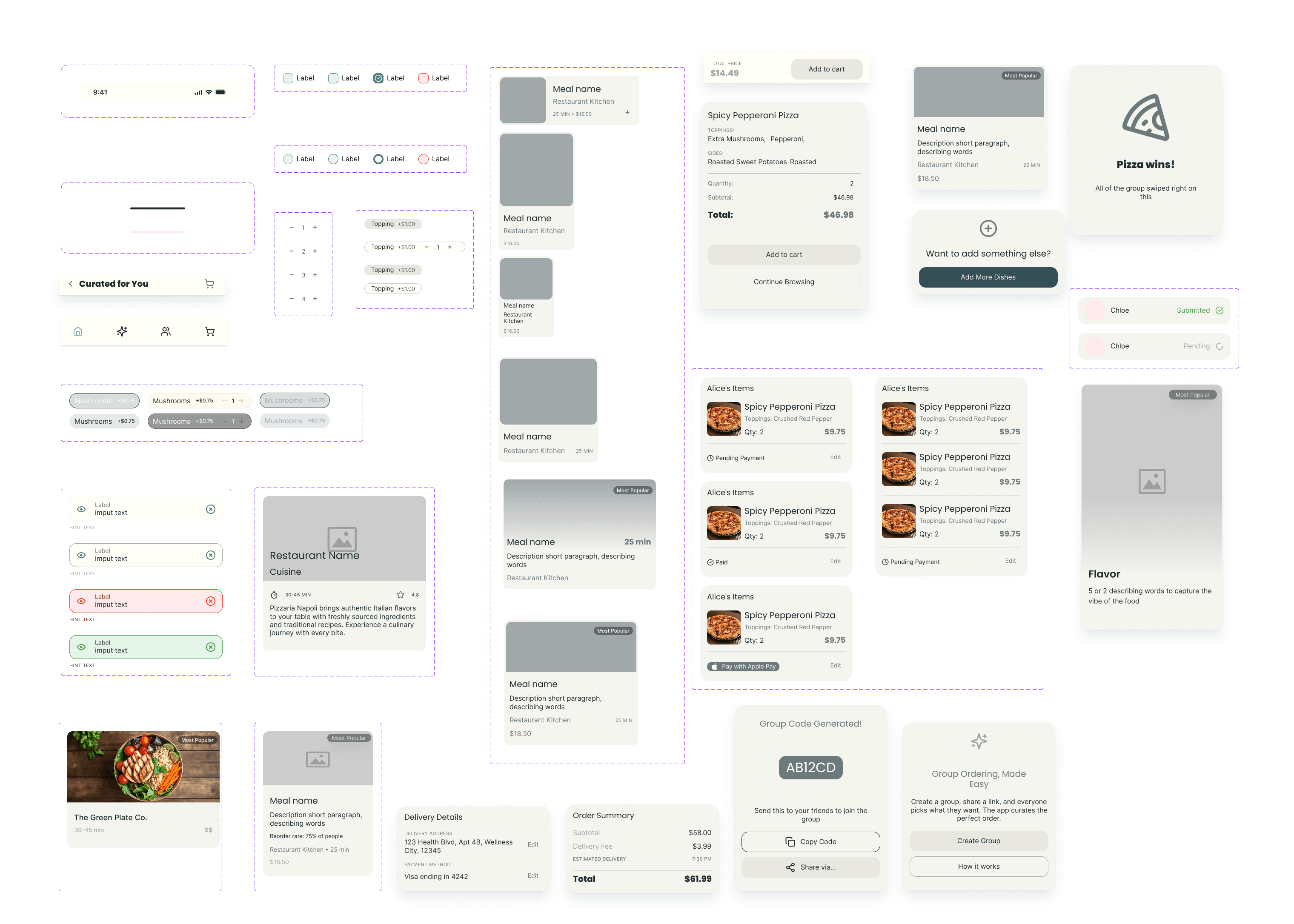
Every state defined before any screen was assembled.
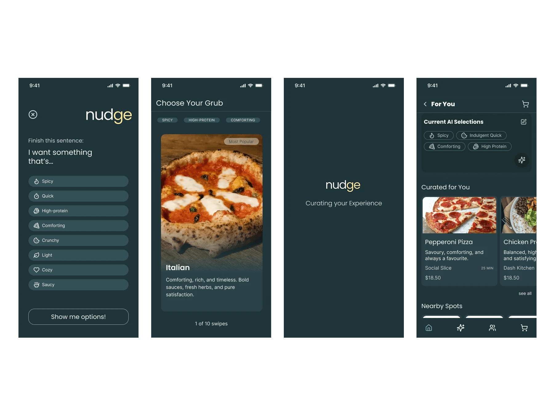
Making the algorithm visible
The home screen shows current preference tags as editable chips, you can see exactly why something is recommended, and change it instantly.
"Most apps hide their AI. Nudge puts it on the home screen, visible, editable, honest."
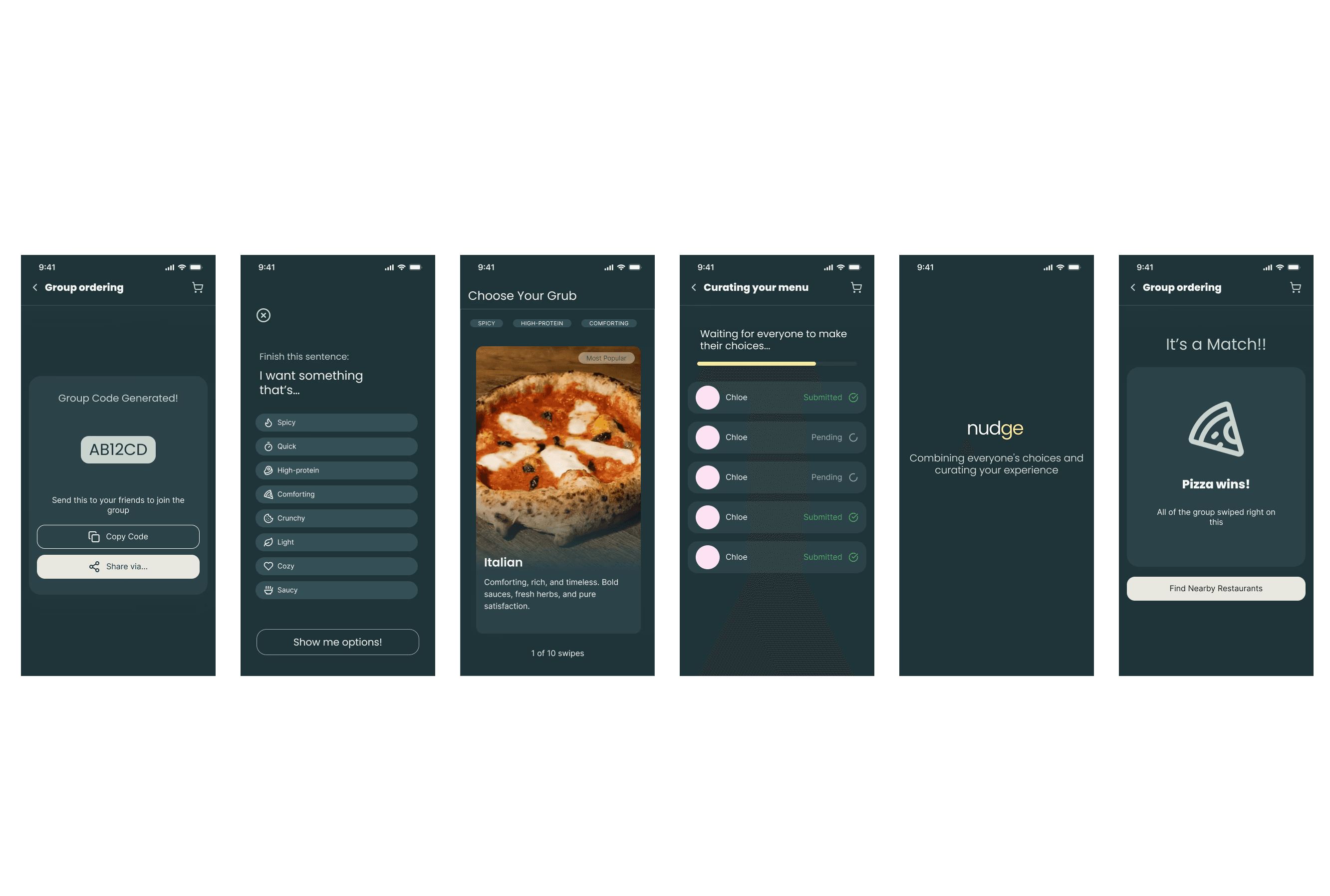
Food decisions as a game
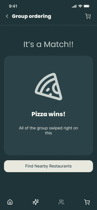
Friends join a group order and swipe on dishes independently. The app surfaces what everyone agreed on, one cart, no arguments.
"Four people, four preferences. The swipe mechanic turns disagreement into a game."
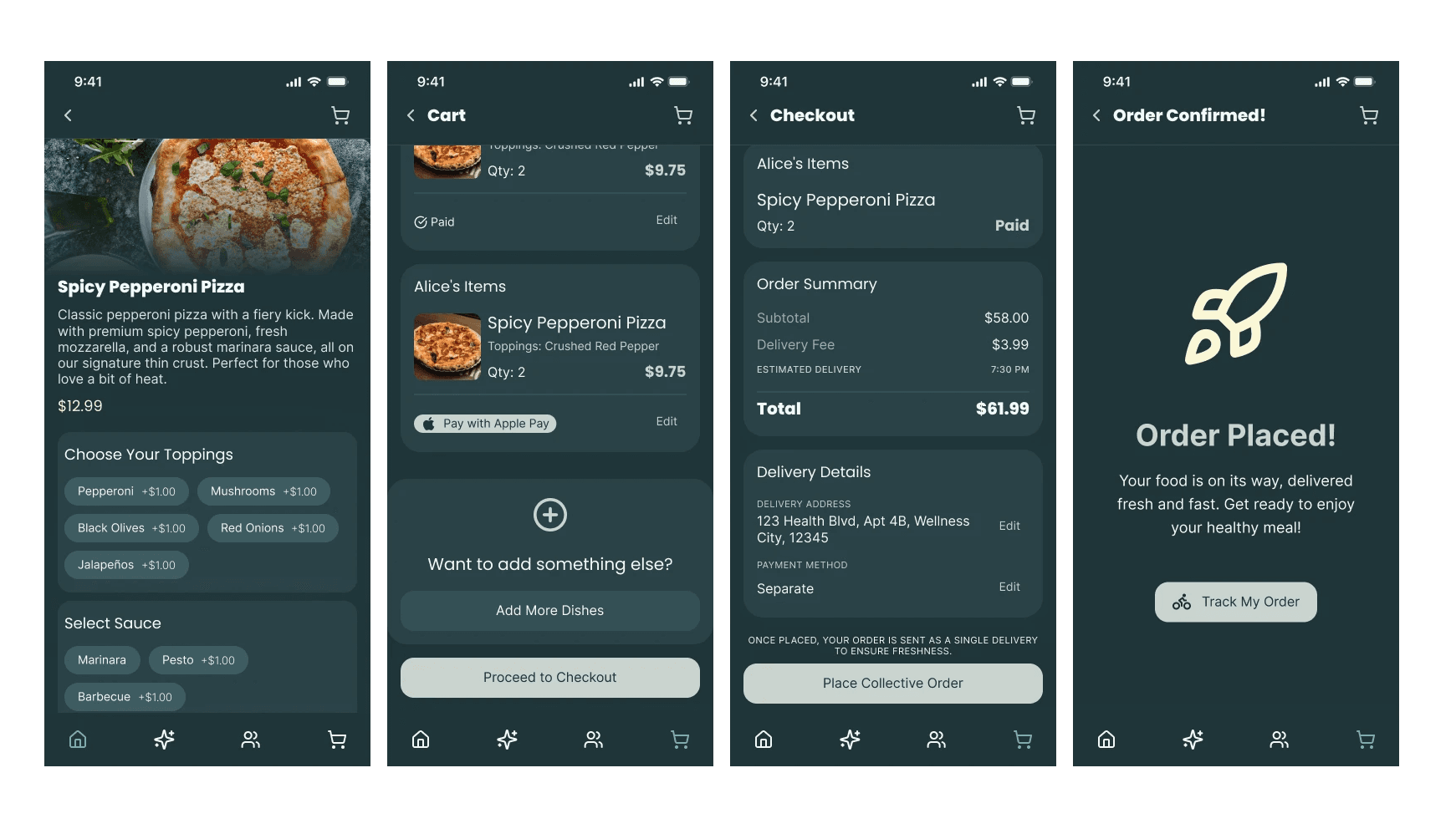
No more Revolut requests
Everyone adds their own items to a shared cart from their own phone. When it comes to paying, each person pays only their share via Apple Pay, the order goes to the restaurant once everyone has paid.
"No Revolut requests. Just tap to pay your share and it's done."
25+ screens. One system.
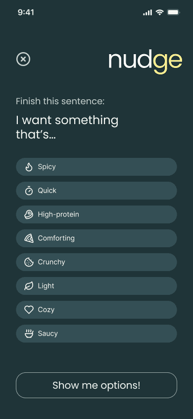
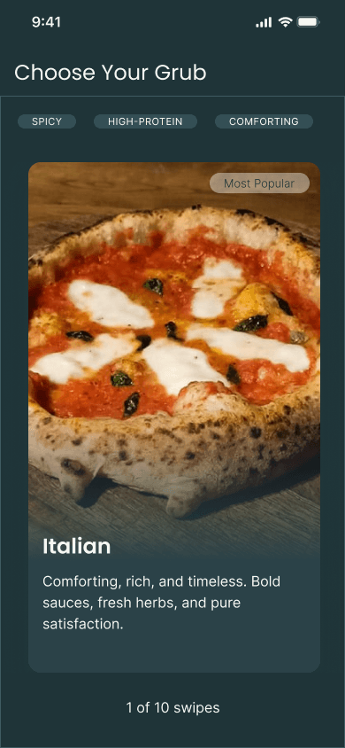

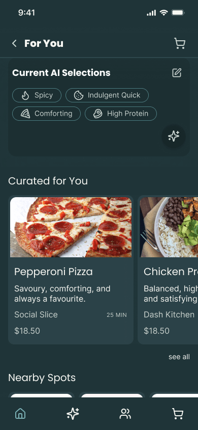
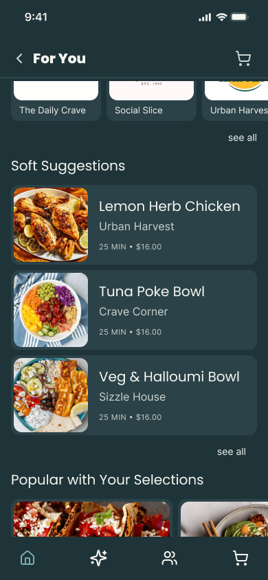
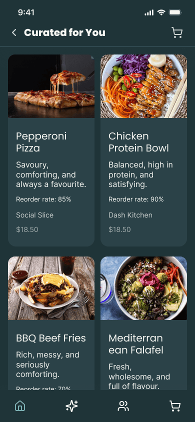
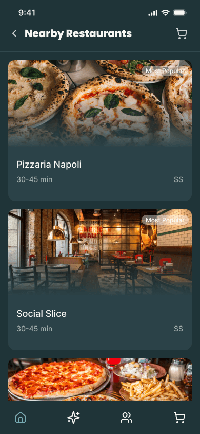
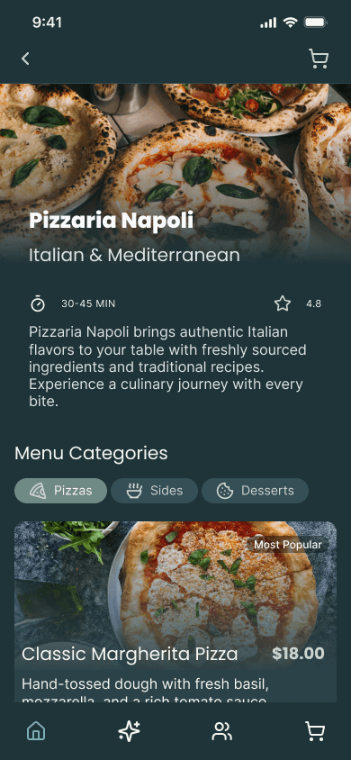
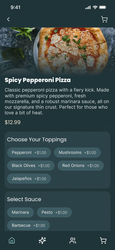
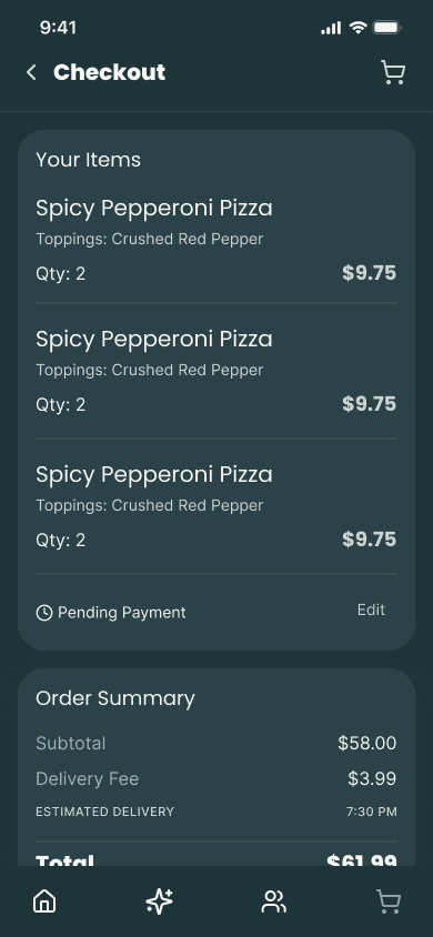
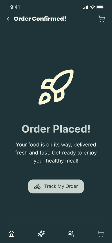
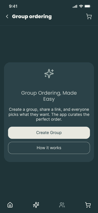
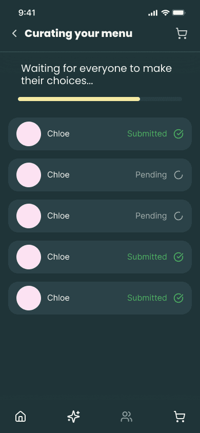
The token system did what a system is supposed to do, one colour change propagated everywhere simultaneously.
The group swiping flow was the riskiest idea in the project. It ended up the most distinctive feature.
Prototype the group swiping interaction, the screens show all states but the animation would make it land harder.
Test the AI preference tags with real users earlier, intuitive to design but might not map to how people think about food.