The Conference Forum
9 biotech conference websites. No shared navigation, no mobile experience, no design system. Each domain was an island.
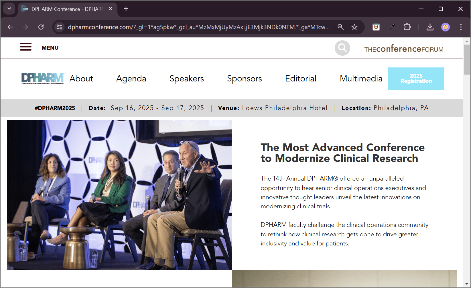
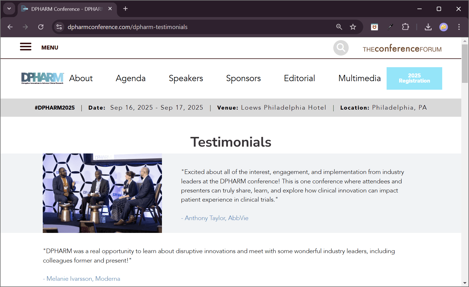
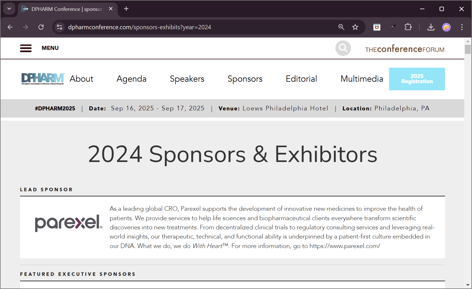
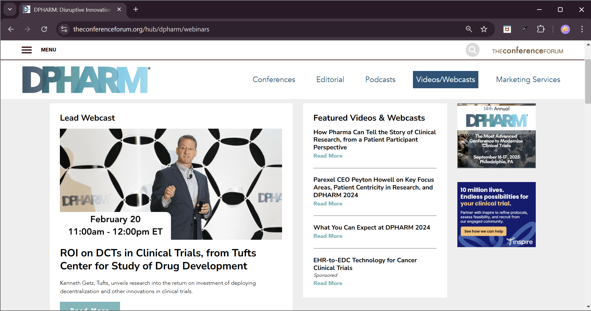
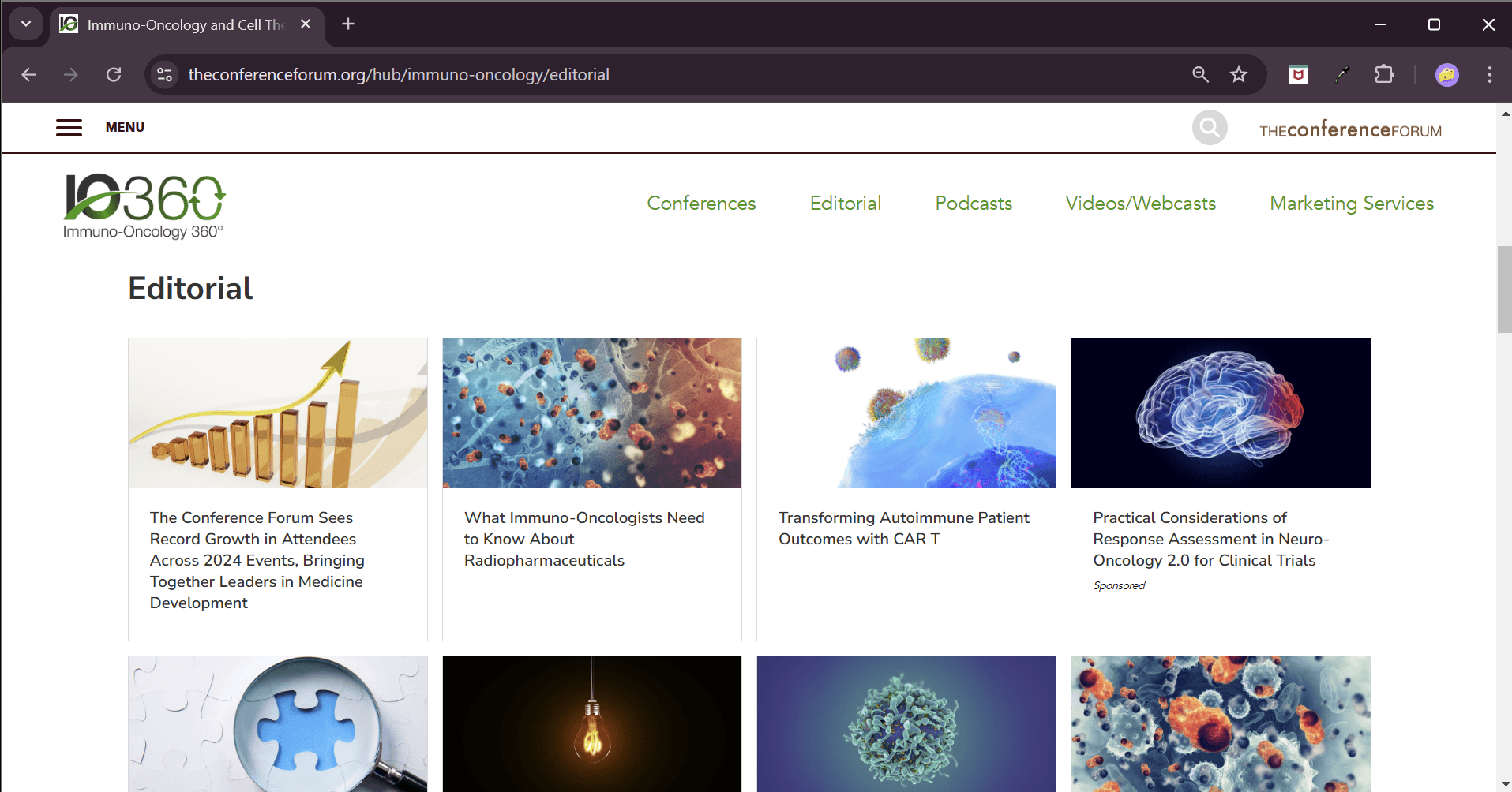
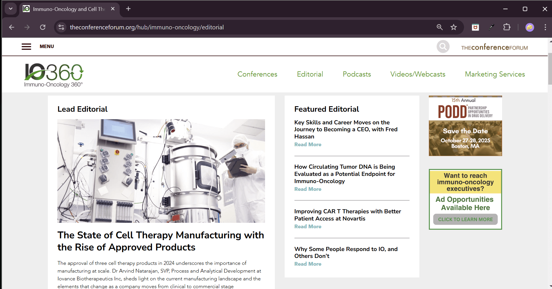
The Conference Forum runs 9 annual biotech conferences, immuno-oncology, drug delivery, clinical trials, and more. Each had its own site, its own navigation, and its own broken mobile experience. The brief: unify all 9 under one design system without losing each domain's individual identity.
How might we build one design system that makes 9 separate biotech conference brands feel connected, without making them feel identical?

One system. Nine identities.
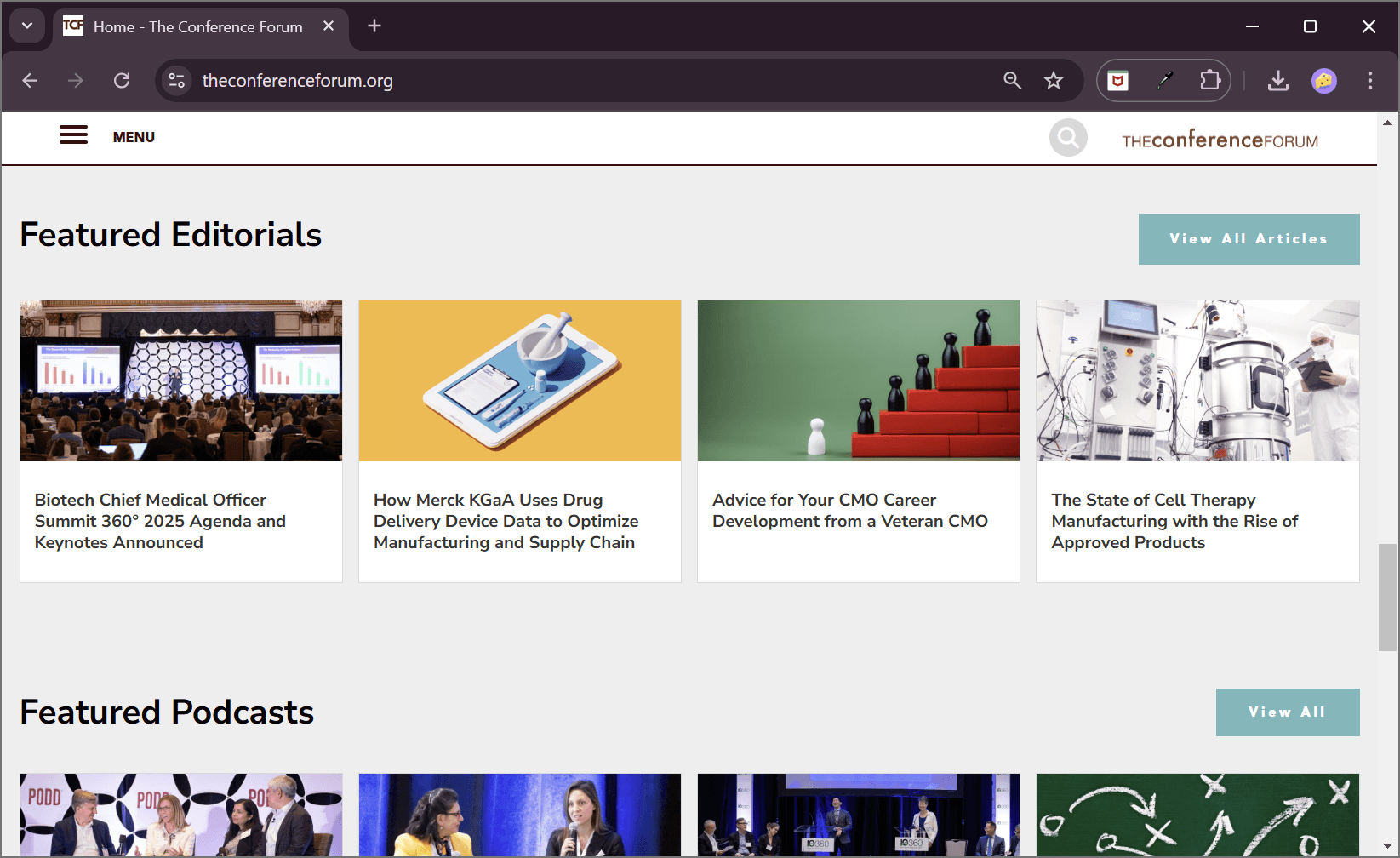
A single component library, shared layout grids, navigation patterns, card structures, and type scale, adaptable across all 9 domains. Each conference keeps its identity through colour and imagery, not structure.
"Without a shared system, 9 teams diverge independently. With it, consistency becomes the default."
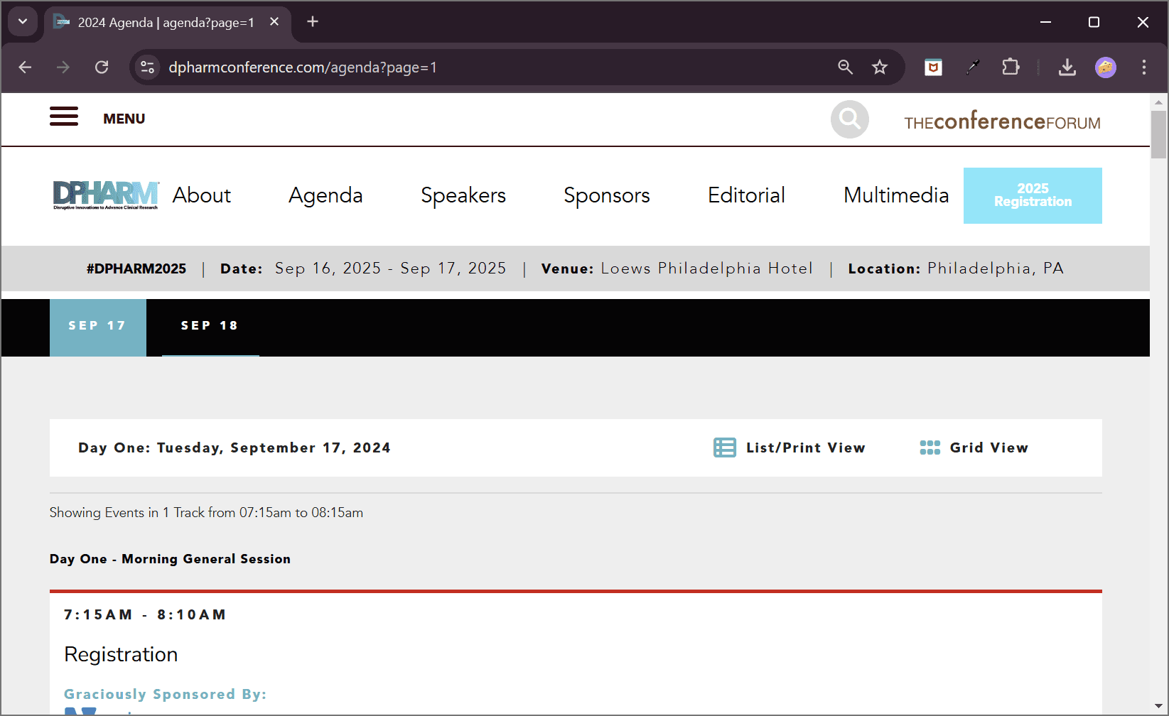
The agenda designed for phones first.
Conference attendees access the agenda on their phones during the event. The agenda was redesigned for mobile: large tap targets, expandable session cards, real-time track filtering, and colour coding by room.
"The call to prioritise mobile was resisted by stakeholders. Post-launch, mobile dominated conference-day traffic."
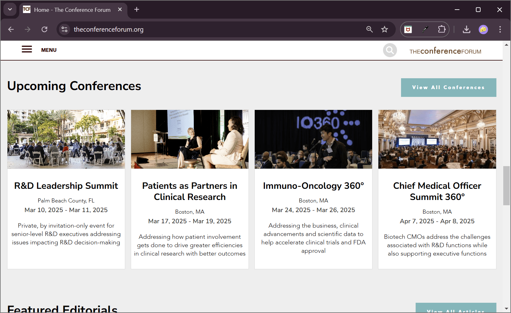
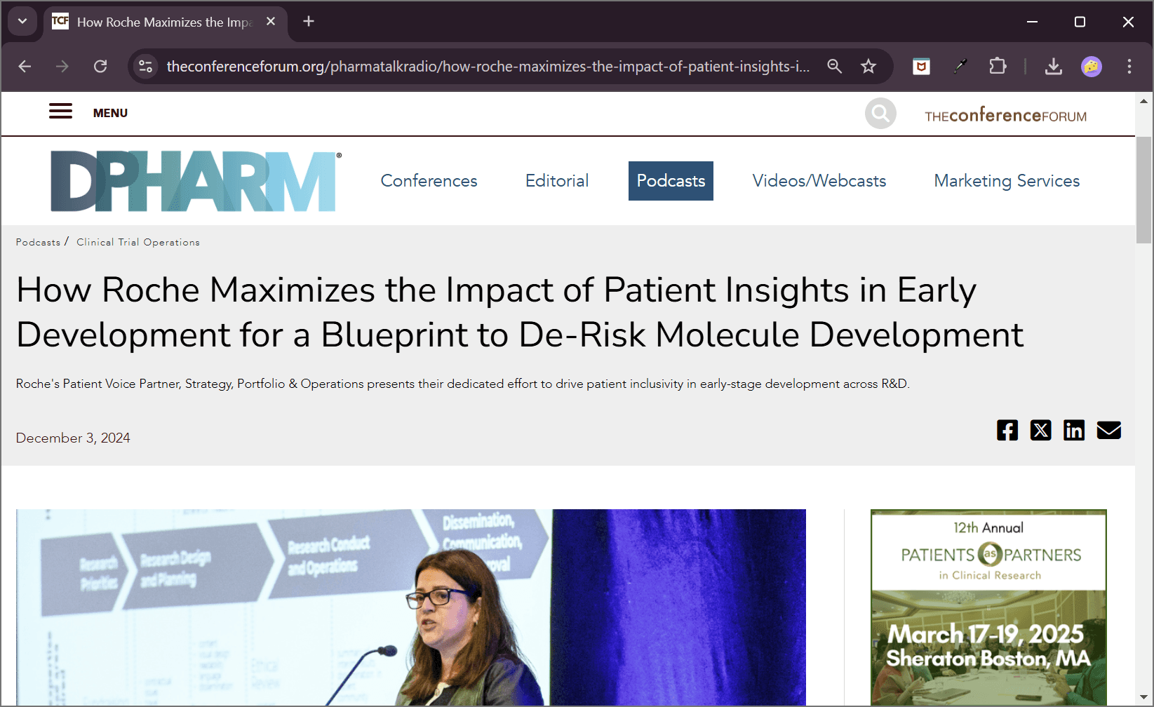
Connecting 9 sites for the first time.
9 separate navigation systems with different labels, structures, and hierarchies replaced by one shared architecture. Users can now move between conference domains and the main platform without losing context.
Shipped. In use. Real users.
The mobile agenda call, prioritised against stakeholder preference for desktop, was validated post-launch when mobile dominated conference-day traffic.
Involving domain teams early in defining their identity within the system drove high adoption. Teams felt ownership, not compliance.
Add analytics instrumentation to track registration rate per domain, mobile agenda engagement, and cross-domain navigation patterns.
Introduce A/B testing on registration CTAs across the highest-traffic conference domains.